
A sale page has one job: to turn a visitor into a buyer. No menu, no catalog, no competing offers. One offer, one argument, one button. If you sell a product, a course, or a service online, this is the page that does the closing.
In this guide I explain what a sale page is, how it differs from a landing page, the sections every high-converting page needs, how to write the copy, and how to build one step by step. I also cover video, design, tools, and the honest limits of selling on Facebook.

What Is a Sale Page?
A sale page, also written as sales page, is a standalone web page built with a single goal: to persuade a visitor to buy one specific product or service. It makes the complete case for the offer (the problem, the solution, the proof, the price, the guarantee) and ends at a checkout button.
Both spellings mean the same thing. I use sale page in this guide because that is how most people search, and sales page when it reads better in a sentence. Google treats them as the same query family.
A sale page asks for money, so it carries more persuasion than other pages. A signup page can be short because the cost of saying yes is an email address. A sale page must answer every objection, because the cost of saying yes is a payment.
Sale Page vs Landing Page: What Is the Difference?
All sale pages are landing pages, but not all landing pages are sale pages. A landing page is any standalone page built around one goal. That goal can be a download, a signup, a booked call, or a purchase. A sale page is the kind of landing page whose one goal is a purchase.
The practical difference is length and proof. A lead generation page asks for contact details and can stay short. A sale page asks for a payment and usually runs longer, with more proof, more objection handling, and a clearer guarantee. If you want the full comparison, read my guide on landing page vs website.
The pages I build for one product follow the same logic: my landing page for a product guide covers the single-product case, and my ecommerce landing page guide covers pages that sell through an online store.
The Anatomy of a High-Converting Sale Page
The sales page anatomy below is the order I use on every page, from top to bottom. Each section has one job, and the reader moves from curiosity to purchase one section at a time.
1. Headline and subheadline
The headline states the biggest promise in the buyer’s words. The subheadline adds the concrete detail: the product, the result, or the offer. If the headline does not stop the scroll, nothing below it gets read.
2. The problem
Name the problem the buyer already feels, in the words buyers use. This section earns the right to present the solution. Skip it and the page reads like a pitch; include it and the page reads like understanding.
3. The solution and the offer
Introduce the product as the answer to the problem, then state the offer plainly: what the buyer gets, in what format, and by when. Keep the offer concrete. Vague offers produce vague interest.
4. Benefits, then features
Benefits first (what changes in the buyer’s life), features second (what the product includes). A benefits list with three to five items covers most offers; the specifications belong in a smaller section for detail-oriented buyers.
5. Proof
Testimonials, reviews, results, case studies, press mentions, or numbers. Place proof near the first call to action and again before the final button. Proof does the persuading that adjectives cannot.
6. Price, guarantee, and FAQ
Show the price with the offer, state the guarantee in plain words, and answer the three or four questions buyers ask before paying. Every unanswered objection is a reason to close the tab.
7. One call to action, repeated
One button text, repeated at the natural decision points: after the hero, after the proof, and at the end. The sales page layout works when the next step is obvious at every scroll depth.
How long should the page be? As long as the price and the doubt require. A low price, familiar offer can sell on a short page. A high price, complex, or unfamiliar offer needs the full sequence. Length follows doubt, not a template.
Sales Page Copy: How to Write Words That Sell
Sales page copy is the text that carries the argument. Design gets the page read; copy gets the page to convert. Two frameworks do most of the work.
AIDA: Attention, Interest, Desire, Action
The headline grabs attention, the opening builds interest, the benefits and proof create desire, and the call to action drives the action. Use AIDA when the buyer arrives warm, already aware of the problem.
PAS: Problem, Agitate, Solution
Name the problem, describe what it costs to leave it unsolved, then present the solution. Use PAS when the buyer feels the pain but has not decided to act. Agitate means describing the real cost, not inventing fear: honest stakes persuade, manufactured panic backfires.
Write in the buyer’s words
The best sales page copywriting examples I study all share one trait: they sound like the buyer, not like the seller. Collect the exact words from reviews, support emails, and comments, then use those words in the headline and the benefits. My rule: if a sentence could appear on any competitor’s page, rewrite it until only your offer can say it.
A weak headline describes the product: “Online course with 40 video lessons”. A stronger headline names the result: “Book your first paying client in 30 days, with a portfolio built from real projects”. The first line informs. The second line sells.
Sales Page Design and Layout
Sale website design is conversion design: every visual choice serves the purchase decision. The page needs one visual hierarchy (headline first, proof second, button always visible), generous white space, and a single accent color for the call to action. If two elements compete for attention, the visitor chooses neither.
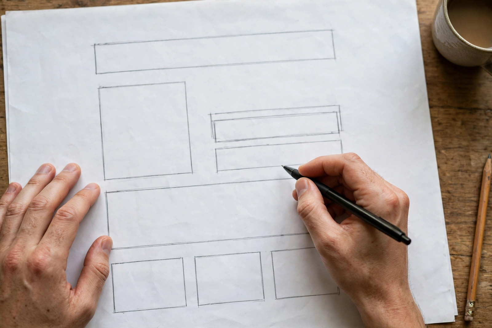
Sales landing page design follows the same rules on mobile, where most ad traffic arrives. The headline must fit without wrapping into five lines, the button must stay easy to reach with a thumb, and the images must load fast. I test every page on a real phone before launch, and I fix what I find before spending one dollar on traffic.
For sales page design ideas, study pages outside your niche: the structure of a good course page often improves a product page, and vice versa. Borrow the structure, never the copy. If you want a starting point, my landing page templates guide lists free templates by goal, including layouts that work well for a sale page.
Sales Page Video: When Video Sells Better Than Text
A sales page video earns its place when the offer needs showing, not telling: a product demo, a before and after, a testimonial in the customer’s own voice, or a short founder story that builds trust. For complex or high-price offers, a two to three minute video near the top of the page often lifts conversions more than any extra paragraph.
Keep it short, add captions (most visitors watch muted at first), and choose a thumbnail that shows the product or the result. Video supports the copy; it never replaces it. Visitors who will not watch still need the full argument in text, and search engines read text, not video.
Sales Page Samples and Examples Worth Studying
Studying finished pages teaches faster than any checklist. In my landing page examples guide I collected sales landing page examples that convert, with notes on what each one does well. When you study sales page samples, look at four things: the headline promise, the order of the sections, the proof placement, and the button text.
For angles by niche, my landing page ideas by industry guide covers twenty industries with the approach that works for each one. And if you need fresh sales page ideas for your own page, try a different lead: a story opening, a problem opening, a comparison opening, a bonus-stack opening, or a guarantee-led opening. The angle changes; the anatomy stays the same.
Tools: Sales Page Creators, Generators, and AI Builders
A sales page creator is any tool that builds the page without code: a landing page builder, a WordPress page builder, or an all-in-one platform with checkout built in. A sales page generator and an AI sales page builder do the same job with AI help: you describe the offer, and the tool produces a first draft of the page. An AI sales page generator can save hours on structure and first-draft copy, but it cannot decide your offer, your price, or your proof. Those come from you, and they decide whether the page converts.
The sales page technologies behind a working page are four: the page builder, the checkout, the email tool for follow-up, and analytics to measure conversions. Pick tools that connect cleanly, and test the full path (page, checkout, confirmation email) before launch. My guide on creating a landing page in WordPress covers the WordPress path step by step, including the checkout options.
Do you need a whole website? No. A one-page sales page website can live on your existing domain as a single page, or on a builder’s subdomain while you test. What matters is the page itself and the checkout behind it, not the size of the site around it.
Can You Build a Sales Page on Facebook?
A sales page on Facebook, meaning a page that sells inside Facebook itself, is no longer possible the way many guides still describe. Meta retired native checkout inside Facebook and Instagram during 2025: Shops are now a showcase, and the purchase closes on the merchant’s own website or by message. Custom Page tabs are gone too (the API was deprecated in 2022 and Page Tabs retired in 2024).
What still works: a Facebook Page and Shop that present the offer and send visitors to your sale page, and Instant Experience, a full-screen mobile page that opens from an ad. The honest structure is Facebook for discovery and traffic, your own page for the sale. Build the sale page on your site, and let Facebook send the visitors.
How to Create a Sale Page, Step by Step
This is the order I follow. Research comes first; the builder comes last.
Step 1: Define one reader and one offer
Write down who the page is for and what exactly they buy. One reader, one offer, one price. A page written for everyone persuades no one.
Step 2: Research the buyer’s language
Read reviews, comments, and support messages about the problem you solve. Collect ten exact phrases buyers use. These phrases become your headline options, your benefits, and your FAQ.
Step 3: Write the headline and the outline
Draft five headlines from the research, pick the clearest, then outline the page using the anatomy above. Writing the outline before the copy keeps the page in the right order.
Step 4: Write the copy, section by section
Write the problem, the solution, the benefits, and the proof in that order. Keep sentences short, cut every claim you cannot support, and read the page aloud: copy that sounds stiff aloud reads stiff on screen.
Step 5: Add proof, price, and guarantee
Place real testimonials, show the price with the offer, and state the guarantee plainly. If you have no testimonials yet, a clear guarantee and a fair return policy carry the trust until the first buyers leave reviews.
Step 6: Build the page and connect checkout
Build in your chosen tool, connect the checkout, and test the full purchase path on a phone: page, button, checkout, payment, confirmation. A button that leads nowhere is the only mistake that guarantees zero sales.
Step 7: Launch, measure, and improve
Launch to real traffic, measure the conversion rate, then improve one element at a time: the headline first, the offer second, the proof third. Small, measured changes beat full redesigns.
Common Mistakes That Kill Sale Page Conversions
These are the mistakes I see most often, and each one has a simple fix.
- Selling before the problem is named. Fix: open with the buyer’s problem, in the buyer’s words.
- A headline that describes the product instead of the result. Fix: name the outcome, add the fact in the subheadline.
- Claims without proof. Fix: every big claim gets a testimonial, a number, or a guarantee next to it.
- A hidden price. Fix: show the price with the offer, early on the page.
- Three different buttons asking for three things. Fix: one action, one button text.
- A page never tested on a phone. Fix: test the full page on a real phone before launch.
- Sending ad traffic to the homepage. Fix: send every campaign to its own sale page.
Frequently Asked Questions
What is the difference between a sale page and a sales landing page?
In practice, none that matters. A sales landing page is a landing page built to sell, which is exactly what a sale page is. Both terms describe the same kind of page: one offer, one argument, one checkout button. I use sale page in this guide because it is the shorter, more searched term.
How long should a sale page be?
As long as the price and the doubt require. A low price, familiar offer can sell on a short page: headline, benefits, proof, button. A high price or unfamiliar offer needs the full anatomy: problem, solution, proof, offer, guarantee, and FAQ. Length follows doubt, not a template.
Do I need a website for a sale page?
You need one page and a checkout, not a full website. A sale page website can be a single page on your existing domain, or a standalone page on a builder while you test the offer. If the offer works, the page earns its place on your main site.
Can AI write my sale page?
AI can draft structure and first-draft copy, and an AI sales page builder can produce a page in minutes. But the offer, the price, the proof, and the buyer’s language must come from you. Use AI for the first draft, then rewrite every line until it sounds like you and speaks to your buyer.
How much does a sale page cost?
A page you build yourself costs the tool subscription and your time: free with a WordPress page or a free builder tier, or roughly $20 to $100 a month for a dedicated builder with checkout. A professionally designed and written page costs more, and pays for itself when the offer and the traffic are ready. If you want the page built for you, my landing page design service covers the full build.
Final Thoughts
A sale page succeeds when it does one job completely: it takes a visitor who arrived with one expectation and walks that visitor from problem to purchase without a single exit that competes with the buy button. One offer, one argument, honest proof, a visible price, and a working checkout. That is the whole formula.
If you would rather have the page built for you, contact me through my contact page and tell me about your offer, your price, and the traffic you plan to send. And if you want the page to rank on Google as well as convert, read my landing page SEO guide before you publish.